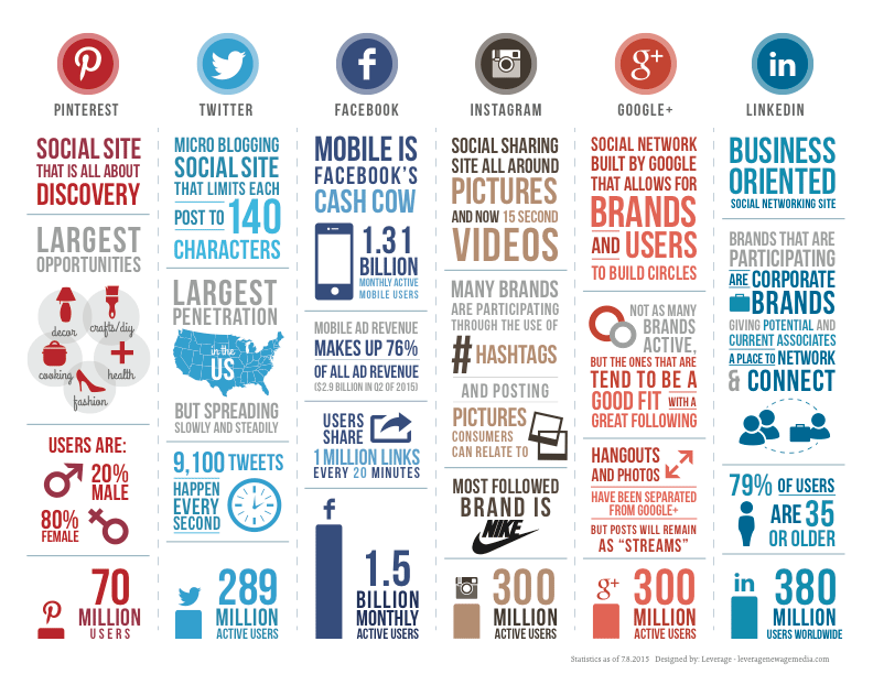
With all of the various social media outlets that people are using these days, we thought it would be nice to come up with an infographic that breaks down each of the most popular social outlets into digestible snippets demonstrating advantages of each and how they can be best utilized. Learn how to best leverage each platform with this social media comparison infographic. Enjoy!

Social Media Comparison Infographic in Words
70 million users
Social site that is all about discovery
Largest opportunities are in decor, crafts/diy, cooking, health, and fashion
Users are 20% male and 80% female
289 million active users
Micro blogging social site that limits posts to 140 characters
Largest penetration in the US but spreading slowly and steadily
9,100 tweets happen every second
1.5 billion monthly active users
Mobile is Facebook’s cash cow – 1.31 monthly active mobile users
Mobile ad revenue makes up 76% of all ad revenue ($2.9 billion in Q2 of 2015)
Users share 1 million links every 20 minutes
300 million active users
Social sharing site all around pictures and now 15 second videos
Many brands are participating through the use of hashtags and posting pictures consumers can relate to
Most followed brand Nike
Google+
300 million active users
Social network built by Google that allows for brands and users to build circles
Not as many brands active but the ones that are tend to be a good fit with a great following
Hangouts and Photos have been separated from Google+ but posts remain as ‘streams’
380 million users worldwide
Business oriented social networking site
Brands that are participating are corporate brands giving potential and current associates a place to network and connect
79% of users are 35 or older
Source: Leverage


Leave a Comment